Au Skin
Create an app that aims to decrease the time spent during the checkout process. Promote a user journey that supports and educates the user in a skincare community on upcoming and current products provided in the marketplace.
Project Overview
Brief
Create an app that aims to decrease the time spent during the checkout process. Promote a user journey that supports and educates the users on upcoming and current products provided in the marketplace.
Deliverables
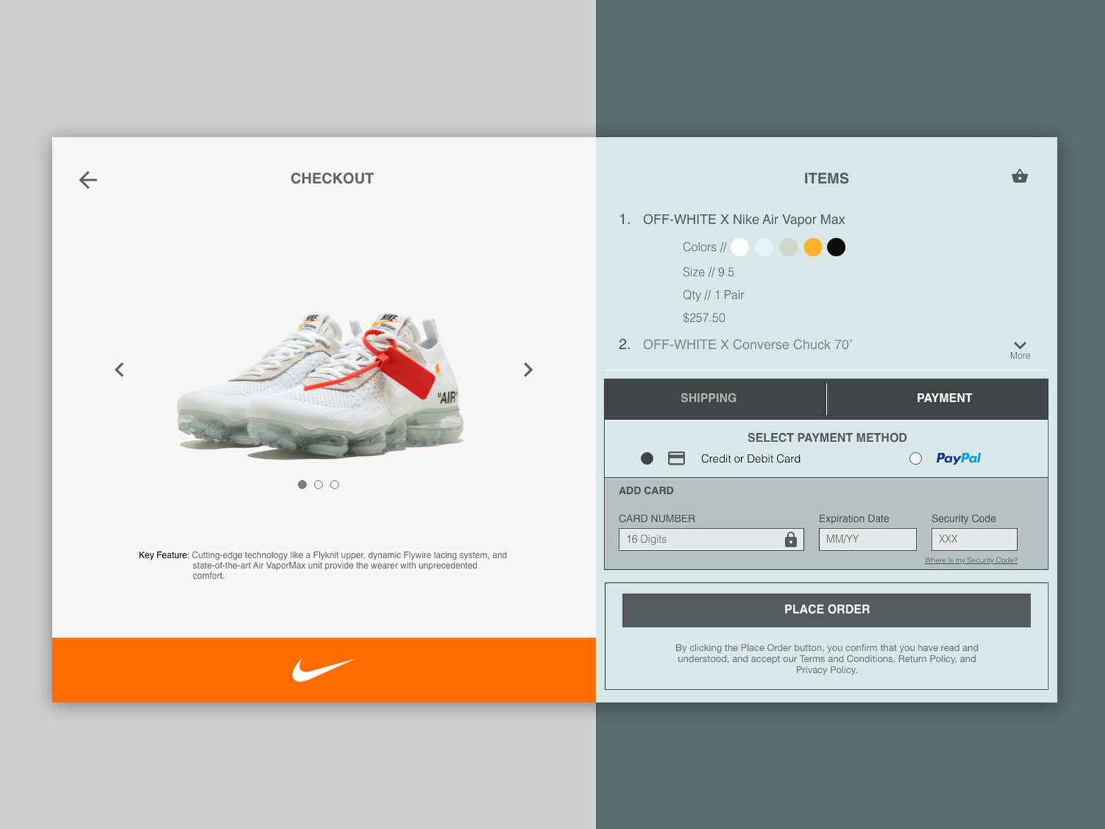
10 app screens: A Shopping cart, checkout (payment), checkout (shipping), confirmation, get started, home, product viewing, profile, marketplace, and a thank you screen.
Roles
Product Designer, UX Researcher
Method
Double Diamond Process
Project Duration
3 weeks
Tools
Figma, Mockup, Notion, Zoom
Design Process
Background
What is the importance of skincare?
Skincare involves maintaining your skin to remain in good condition. Throughout the day, you're shedding skin. Most people want their skin to remain youthful as they continue to age. Keeping an effective routine can prevent acne, treat wrinkles, and help your skin to look its best.
The Problem
People want a trusted way of access to reliable skincare and a product within a central community.
Goals
1. Provide a user-centered mobile application that is engaging
2. Seamless checkout process through account sign-up and a subscription service
3. An accessible application for users with visual, auditory, and other disabilities
Competitor Analysis
I worked with the founder to help discover who some the competitors, direct and indirect would be. There are tons of beauty mobile apps offered to users. After researching, we chose two direct competitors - Beauty Bay, and Sephora. I then chose two indirect applications - Charm, and Think Dirty.
Competitor Analysis - Created in Figma
Competitor Analysis Findings
All four applications share many similarities in regards to design and functionality. Each platform provides a clear use of CTAs with very sleek layouts. For the shopper, these layouts chosen identify variety of experience shopping for the user. Due these reasons, it's important to not make the user have to relearn a product but instead create a user journey that is easy to understand throughout the experience. Every mobile application chosen similar choice of carousel usage, as well as the swipe gestures chosen for the user.
While Think Dirty, Beauty Bay, and Sephora all have provided a purchasing system, Charm took a different approach by preparing different resources where a user could purchase a specific product. This creates a longer process as the user will have to leave the application to make a purchase leaving it hard to track data after a purchase. However, Charm provides a very clean customizable architecture for the user to filter out the experience that closely aligns with them using artificial intelligence. After this, a user is then able to create several strict routines and also share with friends. Surprisingly, Charm chose not to use a search functionality which could then make another part of the journey a bit longer for the user.
Think Dirty was a few steps ahead of Charm by also implementing camera access. They've also decided to use a search option which is great to have for the user who wants to narrow down something specific to their needs. For the user who wants to access an in-person experience, with Think Dirty, you're able to scan a bar code that will then highlight the ingredients of that product.
Beauty Bay and Sephora are the veteran competitors in this market. Each allows the user to select from thousands of beauty brands globally. Sephora has provided a platform built around community allowing the user to engage more such as virtual tutoring access. With so much product as a global company, it has chosen to use an infinite scroll which could leave the user scrolling forever.
User Research
For this part of my research, I wanted to use secondary data for a detailed understanding of consumer products in the beauty industry.
Several problems that caused a decline in the industry include:
1. Shift in retail landscape
2. Main competitors, Ulta and Sephora battle for the top spot
3. Rise and fall of the indies
4. The growth of skincare
5. Trends to watch such as Clean Beauty.
6. Social media shift towards smaller influencers
Around the world, we see a vast change from the physical consumer goods fuse into digital goods. The main question is how to merge consumer products into a more "phygital" ecosystem. Consumers now have high hopes of transparency, traceability, and sustainability by providing more awareness from the brands selling products. If the growing trend of the metaverse continues to take shape, then a new suggestion leads to beauty companies moving into this virtual space. With a virtual community there comes the possibility of less physical products being purchase as everything now has a second identity. Age plays an important factor as well because of this huge transition happening. Women 40 and over have lots of cash they want to spend with a demand to be recognized.
Most people are "try before purchase" consumers. Build more trust is the key too many brands sustaining and having longevity in this new economy. Staying relevant on social platform to continue to attract younger audiences is just as important. This research allows us to identify who should be our target customers.
Defining those who have bought beauty products in the last month
I discovered that navigation and search bar were critical functionalities to successfully find specific products. These are the most prioritized features for the user experience.
User Persona
Using the secondary research collected allowed me to create a persona that will allow for better design decisions based on a user's behaviors and needs.
User Persona - created in Figma
Ideation
User Flow
For this step of ideation, I wanted to use ideas from experienced services to build for a direct community of trusted products. I was able to design a user flow for the on boarding process, and a site map that details the features that would exist with the app.
User flow for onboarding - created in Miro
Strawman Proposal
This method works by creating a workshop gathering colleagues for a 10 minute iteration on the designs independently. After the 10 minutes, we then collaboratively discuss the disadvantages of each design. For this, I sketched out a design for the home screen and spent roughly 10 minutes refining the design.
Design
Wireframe progression
During this stage, I designed native screens that will fit both Android and iOS devices.
LoFi Wires
HiFi Wires
Prototype
Style Guide
Design Principle Breakdown
Hick's Law - Using this law is seen with a minimalist layout for each screen only presenting the necessary information.
Law of Common Region - Using this law is seen through each screen. Categories are broken down together organized in sections that can be scrolled through horizontally primarily on the home screen. The background colors that are utilized makes it clear about the information architecture.
Aesthetic Usability Effect - Users had a more positive emotional response towards the visual design with minor usability problems. The usage of colors along with the branding colors, and icon choice helps to provide a well-polished design.
Jakob's Law - Most users want to use familiar experience ease. I decided to create a similar informational architecture that I know users currently trust.
Typography
Helvetica is a free to use font provides a variety of easy-to-read font styles. This font is transferable to relative styles for Android and iOS. The primary font styles that I use for this app were 'Regular', 'Medium', and 'Bold'. Alternating font styles identifiable hierarchy throughout the app design.
WCAG, Accessibility, and Inclusive Design
Just as every project, accessibility guidelines were important for those who may have different disabilities when viewing/using this application. I used colors with a high contrast so that they were accessible to users with visual impairment. All font sizes were at least 14px or large. I tested the mobile screens using Figma Mirror during the design process to ensure icons and buttons were accessible.
Conclusion
This was a great case study overall. I was able to overcome roadblocks when figuring out the best architecture to provide for users in order to design. When I got past that roadblock, I could then design a solution for those who want direct trust within a community of its direct-to-consumer audience. I am very happy with the outcome of this mobile application and final solutions to scale in the future.
This mobile application is currently in development stages with hopes to launch a beta soon. From there, I believe we will be able to conduct more real-time interviews about the customer experience to gather qualitative data.


